Launch a new B2B product

Overview
Launched in 2015, Welcome to the Jungle provides solutions to companies to enhance their branding and attract talents that align with them. It also supports candidates throughout their professional journeys, including job searches and transitions.
Ten years later, Welcome to the Jungle launched a new complementary solution to the original branding product: the Sourcing. 2 mission teams were dedicated to this launch, which was organized in different stages: a four-month beta test (June to October 2024) with 88 organizations, a soft launch, and a hard launch at the beginning of April 2025.
I participated in designing the MVP of the Sourcing solution for the hard launch.
2 back end, 2 front end, 1 EM
Opportunities
Team Key Results (KRs)
Over several cycles, we focused on improving the user experience for recruiters by iterating and delivering key features.
We prioritized 2 initiatives:
Why highlighting EB assets?
- for answer rate: our discoveries reveal that talent need more information to answer to recruiter (impact of EB videos on proposal : +10pts on answer rate so far)
- for us to highlight the importance of EBAL (ROI)
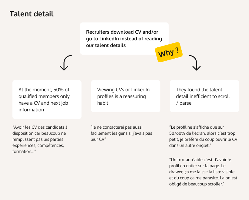
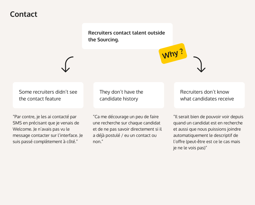
Why?
Process
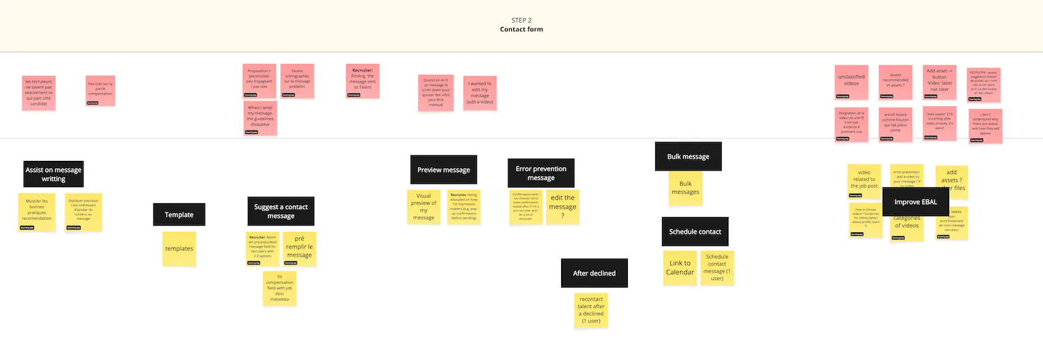
We collected feedback from beta user interviews, client demos, and workshops with stakeholders (Marketing, RevOps, Product).


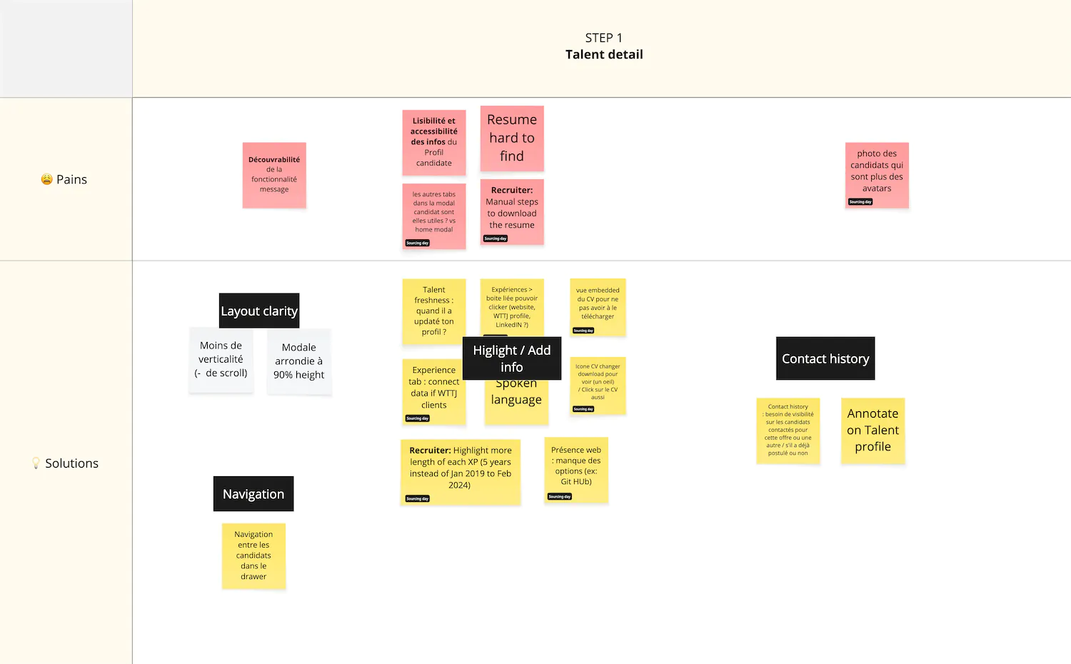
We consolidated all the pain points and needs into one Miro board to generate ideas for addressing each issue.
Problem
How might we help recruiters parse talent profiles and generate interest in contacting them?
By bringing clarity, enhancing the display of talent detail page, the overall navigation, and adding key information through the contact funnel, we expect to achieve better satisfaction in this area.
The enrichment of candidate detail page is already tackle by another mission team (cv parser). At the moment, 50% of qualified members only have a CV and next job information, so we could not simply hide CV from the talent profile.
Ideation
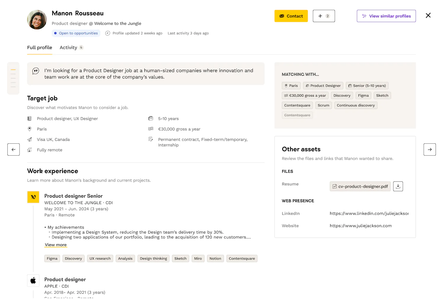
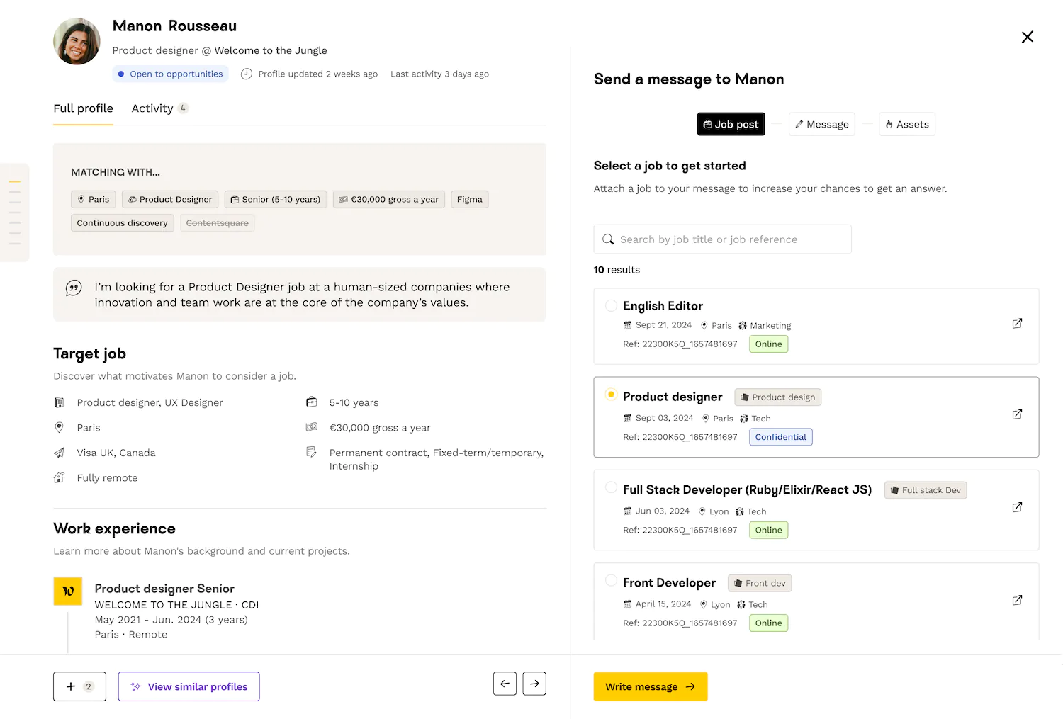
We explored 2 different options to address the lack of clarity and attractiveness of key elements:
I made different explorations of layout for each version.
User testing
With my PM, we tested the 2 versions to derisk the launch, in live + in asynchronous (Maze).
- one mission: explore a candidate's profile and contact them
- ask question about the UX, readability and confirm or not if they have enough information with version A to write message to talents.
We opted for the version A because it got more positive feedbacks from recruiters and highlighted more the EBAL.
Iteration
To finalize the version A, I made some pairing with a senior Product designer and shared my work on Design feedback (ritual).
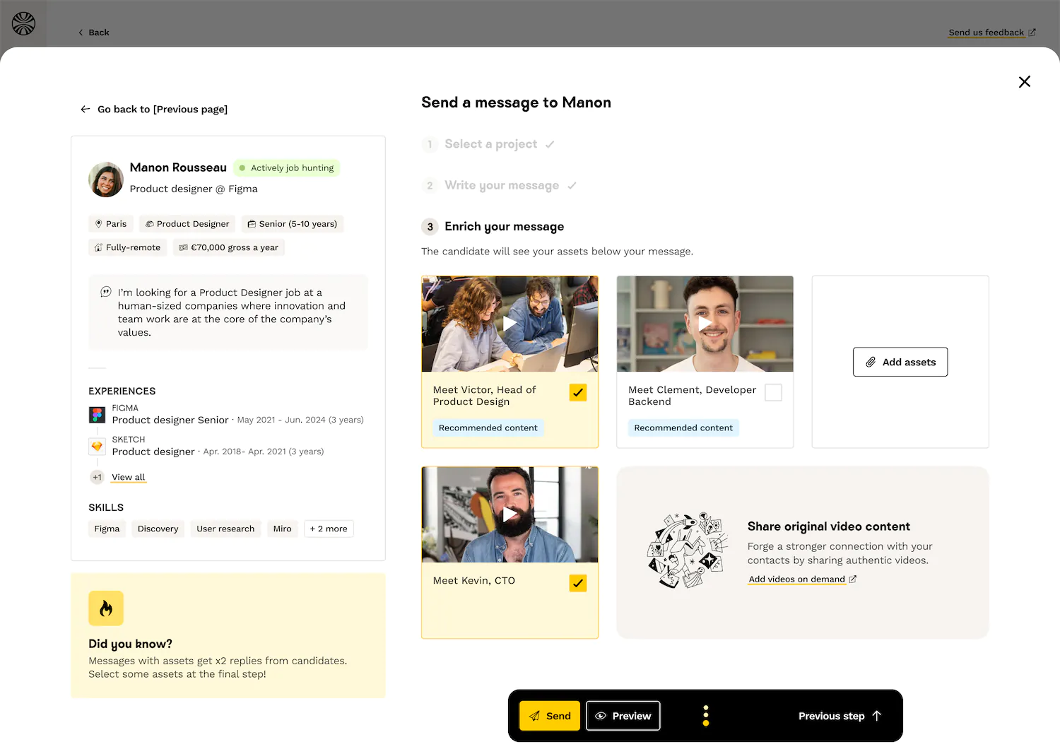
Based on user feedback, we iterated on the contact funnel. We chose to replace the steppers (confusing) by an accordeon system and a floating action bar to the contact funnel to provide a seamless experience.

Delivery
With the Em and PM, we splitted the initiatives in different tickets and prioritized them through our cycles. First, we built the essentials for the hard launch (revamp of the talent detail page and the basics of the contact funnel) and we kept some trade offs for later - after the launch (accordeon fine tuning, navigation between profiles, the preview feature).
- candidate history: a new tab with all the interactions with the candidate
- error prevention: undo feature when sending the message
- preview for recruiters : before sending the message
Outcomes
“Je trouve ça encore plus clair sans compter le fait que ça se met en pleine page et c’est beaucoup plus visible.”
“Les assets donne de la vie au message! Je m’en sers. Ca joue pas mal sur le fait de voir et se projeter.”